Here is a bit of a secret look at the next project I am working on. These are a set of character sketches for some upcoming work. I’m trying to find some characteristics that I like enough to put into my next composition. After spending so much time last piece on a composition I wasn’t crazy about, I’m going to be planning much more!
beaver drawings
polar bear and beaver drawing
Polar bear with hockey stick drawing
beavers roughhousing drawing
beaver with hockey stick drawing
beaver with hoop drawing
I can’t say too much about this now, but more to come soon!
Well! I made so many of these I’m going to give five away for free. The first five people to request one will have it mailed to them. Email me at vanvliet.dave@gmail.com, or comment below. Thanks for viewing!
**EDIT** Well, thats all 5, thanks to everyone who commented, posted, and sent me emails. These went fast, they were all gone in about 7 hours. I will try to do something like this again in the future. Thanks!
Todays topic is Analogous Colour Schemes! Colour can make or break an image, and yet it is so often overlooked in illustration. There are a number of different techniques to use when trying to make an image cohesive, often revolving around the color wheel.
Analogous colours are colours that appear next to each other on the colour wheel.
Rather than get too in depth however, why don’t you check out these four colour scheme examples below. I should note, none of these images are mine until you get to the very bottom.
As you can tell, these images are really quite pleasing, despite the limited range of colour used.
Anders Zorn (1860-1920) became well known for using an analogous palette in some of his own paintings, sometimes limiting himself to only four colours. (It became so well known that the Zorn palette bears his name today.)
If you are interested in a great colour theory tool, check out kuler.adobe.com, it has an easy to use palette to create your own colour schemes.
Here is a bit of work I did as a part of a larger project. I used collage and found as many magazine images as I could fitting into two analogous themes. I then combined them to create a final image. Here are the two separate collages:
And here is the final image, out of context so it won’t make much sense, but thats ok. Red and green are complimentary colours, so by adding these two collages together I was able to create something that was visually cohesive.
Well, thats it! Thanks for reading. Get out there and make something.
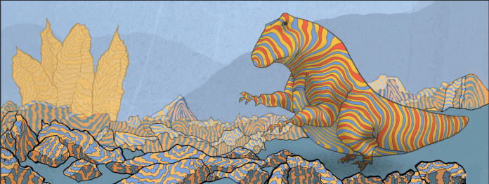
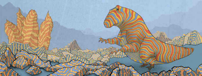
Alright! So it has been a busy week this week, but it’s time to (finally) conclude this piece. Tiny-Legged T-Rex, it is time to be done.
If you remember last time, I left off with the foreground rocks complete, but the middle and backgrounds were flat empty shapes. I had to enter a zen state of mind to finish these stripes, because no matter how cool I think they look, they get boring to draw!
I draw each line out by hand, scan it into the computer, and then trace over it again in photoshop. It got a little tedious, if I were to explore this style more I would have to find a more efficient way to achieve the same effect.
Here is a quick look of the pencil lines used for the rock stripes.
Above you can see the rocks pretty much filled in. It might be hard to tell, but I thinned out the black outlines on the rocks in the distance to try and give the effect that they are receding into the back.
I made the tall vertical rocks red to balance out the image a bit. I didn’t want the only red in the image to be in the dinosaur, but I also didn’t want them to compete for attention. The eye is drawn to bright reds really quickly, so I dimmed the red in the rocks.
I also noticed that the very distant mountains, the faint blue shapes in the very back, might be drawing the eye toward the rocks and not towards the dinosaur, so I changed them to flow towards the dinosaur and tightened up their shape a bit. It’s a pretty minor change but I like how it worked out. I also added some shadows to the rocks in the very front.
A few minor changes, the addition of a rock in the bottom right that had been cropped and had escaped my attention until now, and it’s all done! For now… ahhhhh. There are still some things I’m not quite happy with, but this will do.
Here are some things that could be addressed:
The color of the grass might be a bit off, there is probably a better color to pull together the whole scene.
The shadows below the front rocks and the dinosaur itself don’t quite work. They don’t fit into the image as well as some of the other parts.
The entire composition could be re-done to make it more engaging.
Well, if you have been following this since the beginning, thanks for checking in. I’m happy with how this turned out, and I learned a lot. Now to figure out what is next!
From woodcut to paper cut, here is another illustration style that would be great to try out in the future! There is something I find so endearing about paper cut illustration. I love how flat illustrations can look really amazing. I love how there is an element of hand work and analog fine motor skills. I love the idea of using only texture and color to try and create an image with depth and character. As you can see below, it can be done quite effectively.
Hover over the image to find out the artist/studio.
I Don’t Recall Fight or Flight Setting In by Meghan Stratman
The Wave by Theater Clouds
Side by Side by Theater Clouds
Flaming Fox by Thumb Demon
Bears are Best by Kate Fete
Rise and Skate by Thumb Demon
Paper Art by Eiko Ojala
Little Rocket Weasel by Meghan Stratman
The Little Red Riding Hood by Griottes
Illustration for Danish Railways Magazine by Hvass & Hannibal
Paper Art by Eiko Ojala
This post wouldn’t be complete without showing you the work of Bomboland. (Check out their work here) Based out of Lucca, Italy, they do some of the best paper cut-style work I have seen. When I first stumbled upon their pieces I felt completely torn, do I love it because of how wonderful it is, or hate it out of jealousy because I don’t think I could ever produce something like it? A bit of both I think. Below are some illustrations from a book they did, but check out their website, you won’t be disappointed.
How do you make dinosaurs big? Easy right? Thats what I thought, turns out its not nearly as easy as I thought. Todays topic: Forced perspective and making things BIG.
After working on my previous drawing of a dinosaur for the last couple of weeks (an hour or so every couple of evenings), I began to think that the composition could really use some work. I found it to be un-engaging, borderline boring even.
I have enjoyed working with the contour lines, and it has been fun working with colour, but it’s time to work on some composition.
So, sitting down, I began to sketch out some thumbnail ideas.
I decided it would be a good idea to try and create a dynamic composition where the dinosaur is being viewed from the bottom up, full of dramatic size and imposing frame. The problem? Every time I tried to draw the dinosaur as BIG he came out as FAT. Check these out.
Small dino, thumbnail, and study.
Not too tall, but too fat for sure.
Getting closer? Still a pretty big belly on him.
Huge foot, but thats about it.
I went back and for the between drawing, and looking at these reference images below. These artists did a good job of creating characters that look large, without being overweight. Some even look skinny!
Below is an drawing that I’m starting to feel ok with. The front claws are off, and he still looks a bit fat, but I’m happy with where it is headed. Some things I found helpful:
Placing one leg in the foreground, with exaggerated scale, helps to really emphasize the forced perspective.
The hanging hand, narrowing as it rises, helps to show how tall the dinosaur is.
Adding trees and birds aids in adding a sense of comparison and scale to the image.
Showing the underside of the clouds helps explain that the viewer is looking up rather that from the side.
Let me know what you think. If you have any ideas or suggestions on how to make this guy look LARGE without looking fat, post them! I would love some help.
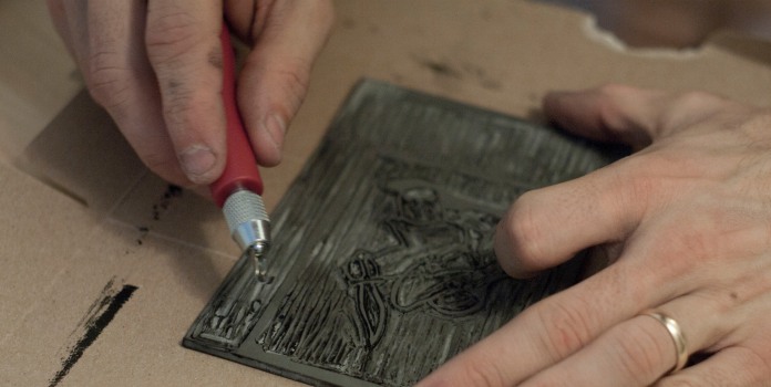
That time already! Today’s topic, Woodblock Printmaking. I have been looking at woodblock prints quite earnestly for the last couple of months, after seeing a kickstarter campaign where the artist Jed Henry and woodblock printer David Bull turn contemporary video game scenes into traditional woodblock prints. I’m not a huge video game person, but some of the pieces are awesome! David Bull uploads videos of him cutting and printing to youtube, I could watch it all day long. Here is one of them:
Here is a quick video about the process of traditional japanese woodblock printing.
Check out these other woodblock prints. I tried my best to find the links to bring you back to the artist, enjoy!
Winter Light by William Hays
The North Wind (Discontinued) by Kirsten Etmund
Carving of The Moon by Tugboat Printshop
Not actually sure who the designer is for this one. It might be a matchbook case (most likely) which means it is probably not a woodcut print. Interesting design though.
Leaf of Gold by Walter J. Phillips
Female Nude Seated in Water by Ichijo Narumi
Rickshaw Cart by Jed Henry and David Bull
Mamalilicoola BC, by Walter J. Phillips
Untitled (Peaks) by Isobel Adams
“Langegasse nach Zinnwald im Winter” by Erish Buchwald-Zinnwald
Two Children with Lanterns by Shiro Kasamatsu
(Unsure of Title) by Sozan Ito
York Boats on Lake Winnipeg by Walter J. Phillips
Print of Dog by Kiyoshi Saito
Ipswich Street by Arthur Wesley Dow (1895)
I love how the texture of the paper plays such an important role in the prints. Looking at how atmospheric perspective and backgrounds are handled in some of these prints was a big influence in how I handled it in this piece.
For a cool contemporary woodcut printshop, check out Tugboat Printshop, or if you area in the Edmonton area, take some time to visit SNAP.
Alright! After a week or so of trying some different things out, it’s time to get back to dinosaurs. After sketching out some initial ideas, and taking the time to render the dinosaur in a way I’m happy with, it was time to put him into an environment.
In a video titled The Biggest Mistake Beginning Illustrators and Animators Make, Will Terry (can you guess who I’ve been watching lately?) mentions the importance of being able to put characters into a scene or environment. Employers, clients etc. are not only looking for interesting characters, but for them to be acting within a world.
So, knowing this now, I decided to create an environment for the dinosaur I drew earlier.
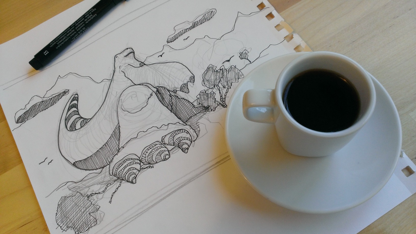
A cup of coffee is ready to keep me going! As I have done previously, I printed out the line-work from the previous piece so I could draw on it by hand first. I prefer working with a physical pen if I have the option.
Here you can see the line-work scanned into my computer. Some of it will change a bit a little further down. I tried to carry the contour lines found in the dinosaur into the rest of the image.
I was having some trouble figuring out the colours. I wanted to have the stones ‘sit’ on the the surface of the paper, and I also didn’t want them to take too much focus away from the dinosaur himself.
Here I am starting to find something that I’m happy with. The cooler blue helps to remove some of the focus off the rocks. Because I want this image to appear to have a foreground, middle-ground, and background, there are a couple things I tried to do to create some depth.
I thinned out the line weight on some of the rocks in the image above. On the left you can see thick black outlines around the rocks in the middle. On the right I trimmed those lines down, and faded the black out a bit to push them back into the page. By having the most saturated blue in the foreground, and moving into progressively paler blues as the image moves back, hopefully I was able to start to create a bit of depth. I tried to make the mountains in the very back quite pale, and removed the outline from them completely to hopefully show they are way back in the image.
So here it is so far, not quite complete. I have a lot of work to do in terms of composition! This picture, while a good exercise, isn’t really as engaging as I think it could be. The dinosaur is just standing there, plopped in the middle of a rocky land.
I have some more work to do on this image, namely all the rocks in the middle-ground and background. They could really use some shadows to put them on the ground so they don’t appear to float as much. I’m trying to decide how to approach the contour stripes on the middle rocks. Any ideas?
Oh man! What a cool dump today, Three Dimensional Type. (Though much of it is not true typography I suppose.) There are so many more things I wanted to include in this post, I will have to do a second round in the future. I really recommend checking out some of these sites individually, there is some excellent work being done here. I love going back to designers sites to see how individual pieces fit into their whole portfolio.
Hover over to see the artists name, click to find the url to their website, and enjoy!
Life by Linna Xu
Atype by Lobulo Design
Catch by Anne Jordan
ARS Electronica Poster by Manel Portomene
Ampersand by Justin Mezzell
Ding Dong by Smiling Wolf
Your Song by Antonius Bui
Urban Planner by Graphic Dirt
Font Alphabet Puzzle by Looodus
Respect Type by Miguel de la Garza
C by Sabeena Karnik
Good Design is Good Business by Rizon Parein
Akzidenz Grotesk by Johnson Banks
Pop Up New York City by Daisy Lew
Pop Up New York City by Daisy Lew
Pop Up New York City by Daisy Lew
Feeling the 3D type yet? If you are, play this video and watch these gifs, that should keep you in the mood.
And finally, if you STILL haven’t got your fix, check out this book.
So I tried a bit of an exercise I saw done by illustrator Will Terry in a video he put out on designing characters for children’s books, and you should try it too! Will shows a neat trick that works well when drawing animals, no matter what the shape, size, or animal type.
He says that while drawing if you are able to pick out important characteristics of an animal, (a cat for example has whiskers, a tail, a set of round lips, pointy eats, etc) then you can draw those characteristics on any shape and your drawing will be recognizable as that animal. If you press play below the video will jump to the relevant section.
After watching him, I decided to give it a shot on my own, but instead of using the characteristics of a cat, I would use those of a shrew. I pulled up some images on google to get an idea of what I was looking for, and came of with these traits:
I then sketched out a series of different head and body shapes on to a large piece of paper, and added the shrew characteristics afterwards. Pretty fun!
Please excuse the poor quality of the images below. I captured the work-in-progress pictures on my cell phone, rather than scanning them in, so the colour is quite off.
Wiener Shrew
Three Amigos
Hunchback
I found it really interesting that even shapes I was sure wouldn’t look like a shrew, did after all the characteristics were added. (Although some maybe were a little shaky.)
So, a neat exercise to try on your own! Choose an animal you find interesting, give it a shot and let me know how it goes. If you actually try it out, send me a photo and I will upload them!
Oh also, I have some more dinosaur work to put up here in a little bit, maybe around this time next week, so stay tuned!
Thought I would try something new and post a few things I’ve been looking at over the last little while. I gave credit to each image wherever I could find it. It’s actually worth checking out some of these designers websites, there are some pretty inspiring bodies of work!
I’ve been working the last few evenings on tightening up the ideas I had presented in a previous post. With the help of some home made espresso, I printed out a rough outline of my earlier dinosaur sketch and sat down to draw!
Something to drink of course.
Here is the printed outline filled with pencil lines. I really am using these contour lines for two reasons. The first is to add a bit of interest and diversity to the image, allowing for some variety in colour. The second, and possibly more important, is that it allows me to create the illusion of volume and depth.
Initial Sketch with shadows.
Base colour added.
Figuring out some colour combinations.
Blue stripes with a red belly…
…or red stripes with a blue belly?
Why not both?
Click to enlarge any of these images. These show a bit of my process, and help illuminate a couple of decisions I have been making along the way.
So here it is so far. There are still some improvements to be made, and I’m not 100% happy with some of the contour stripes, but it is a good proof of concept. Next stop, some environment and context.
Let me know if you like it, or if you have any suggestions.
Over the last few evenings I’ve been playing around with this sketch of a dinosaur. I swapped the large muscular legs and skinny arms of a T-rex around, creating a kind of chicken legged dinosaur who lifts.
Some of these images I am more partial to than other, I think I find the 5th, 6th, 9th, and 10th the most interesting.
Original sketch
Brush and ink on paper
Paths in illustrator
Messing in illustrator
Messing in illustrator cont.
Flat image in illustrator w/o outlines
Illustrator + loose shading in photoshop
Sketch w/ more interior lines
adding some colors
Colours in photoshop w/o lines
Lines + shading + textures
I haven’t settled on any one style yet. Which one do you prefer?
I was hoping to get a bit of practice in on Illustrator, here is a quick image I worked on this evening.
I began with a quick sketch of a sloth taken from some source images on google.
I brought the drawing into Illustrator and drew over my pen lines with the pen tool.
I looked into a few color schemes, but settled on this one. If you advent used Kuler before, check it out, it is a great free color theory resource online.
And here is the final image. Nothing special, but a good chance to get my feet wet.
Here is some work I did for a friend of mine on campus who organized an event teaching high school students about Nano Science. If you’re curious about the event itself feel free to check out their page.
It was a pretty fun, quick project to work on, I sketched the image out, scanned it into the computer, and added a few colors and text for effect. I will post some pics of the design in action if I can get my hands on them!
I tweaked the beaker ever so slightly from the drawing, adding an extra reflection line in front of the scientist so that he reads as inside the beaker, rather than on top of it.
I sent off two versions, one with the red halftone effect added, and another without. (the latter seen above) I couldn’t decide which I liked more so I just sent them both off to my friend and left it to him to make the decision. Problem solved!
Here is a painting I’ve been working on lately, it’s the interior of a warehouse I got to check out a few weeks ago, pretty cool!
I have had a lot of freedom in the last little while to really explore my style when it comes to painting. I love that I get to play around with expressive brushstrokes, rubbing away layers of paint, and other techniques I’ve never really used. For the first time all year I’m starting to uncover a bit of the same elements that were present in a few of my large drawings from a year ago. (Here for even more.)
I’ve Included another photo below to try to give it some scale, but I’m not sure it helps that much. Oil on masonite board, approx 43″ x 43″.
Well! Its that time of year again, students all around the world are hitting the books and preparing for final exams… or in my case, painting. Here are a few things I’ve been working on (almost exclusively) over the last few days, I hope you enjoy!
Above is a partially completed work, you can check out the bottom of this post for the finished product.
Painting really was a challenge for me this year. Just the amount of work required is quite staggering, each painting ranges more or less from 1 to 8+ hours. (Well okay, only one was 8+.) I’m sure I could have dropped all my other courses this year and still have been busy with it, check out the pile of stuff I have on the floor too. My focus in school is definitely design though, so I think there were a few times where painting took a bit of a back seat to other projects. That being said, I did work really hard, and there are some where I surprised myself with what was done.
This one above is the ceiling of the studio, the goal was to capture a sense of architectural space. I like it because it seems almost abstract at first, but there is still a quality of depth and area. This was done fairly early after midterm and I really began to notice an improvement in my work after this painting. It was a bit of a turning point from the stuff I was working on before it, which was, I must say, extremely frustrating.
Below is a reproduction from a Jenny Saville section and I love the way it turned out. The colours are a bit low-key, but thats okay, its a pleasant change from my normally bright work.
And finally, here is the completed version of the very first image I showed. It is a reproduction of a Catherine Kehoe self portrait. A big, yet subtle, change from the image at the very top is the sizing, placement, and colour of the eyes. Its amazing how the smallest alterations can move an image from something that doesn’t read well to a more finished coherant piece.
The quality of the photos is lacking a bit, I took them with my cell phone camera. The studio is locked for the next week or so while we are graded though, so this is the best I will probably have until after the Christmas break.
I’ve decided to post the application portfolio I used two years ago to get into my program at school. This is definitely some older stuff, but thats okay. Keep your eyes open for the bird with the dinosaur tail!
It seems like I’ve been posting a lot of school work up here lately! Classes have been really picking up for me so it’s been a bit easier throwing some projects up that I already have digital copies of. (Though I’ve just scanned a bunch of sketches for this post.)
This is a project we worked on in class a few months ago. We were to create a podium for a standard classroom environment, with enough room for a monitor, desktop computer, keyboard, mouse, and everything else needed for day to day instruction.
I tried to create a modular system that allowed shelves to be added or removed depending on how many were needed. Each shelf has a cutout on the back right side to allow for computer cords to pass through, bundling them neatly.
Check out the thumbnails below to see a few of my ideation sketches. Some of them were pretty fun to come up with!
This final image shows the keyboard tray extended. I left the computer hardware un-rendered in the first image to bring a bit more attention to the podium itself, so I decided to render it all in the image below.
Here are some drawings I did a while ago in a few model sessions. I found that during the periods where I was doing live model sessions my drawing skills improved faster than any other point in my life.
I loved working on this top drawing. It just has a freedom and looseness to it. Some days I feel like I really need to fight with the piece I’m working on, but this one was a joy.
Working large, and fast, was a great experience, and doing it all from a live model meant that I really had to develop the ability to make tough decisions involving perspective and value.
I still have a difficult time with faces. (Check out my first post ever for more on that) But I have been noticing that the process is becoming more and more intuitive.
In these bottom two drawings I tried to manipulate the background to add contrast to the figure in the foreground. Where the figure is light, the background is dark, and vice versa.
So! Christmas break is coming. I was thinking of maybe challenging myself to sketch a face a day, or 50 faces or something over the course of the break. Not sure exactly what I will do, 50 seems a bit ambitious, but it would be a great way to keep my hand sharp over the holidays.
Here is a project I worked on with Christina Sicoli. We designed a dog bed based on the the work of contemporary architect Toyo Ito.
One thing that this project taught me was the importance of planning. We spent a ton of time drawing out ideas and possible designs. It was great working with another person, it forced us to communicate our ideas well and make sure we were on the same page for each decision. As you can see below, we had a lot of decisions to make!
Here are some of our many sketches:
The idea was to create an architectural form that emerged out of the ground, much like Toyo Ito’s design for Grin Grin Park in Japan. These are some views of our sketch models:
We ended up using blue foam to shape the form, and covered it in fiber glass. It was so much fun! It was a crazy learning curve as neither of us had used fiber glasses before.
Below is a video of our process. If you look closely you can see my hands in some of the shots. ;) I have to give a huge amount of credit to Christina for this, she edited the whole thing and did a really good job.
Here are some more images of the completed bed, click on them to enlarge:
We ended up selling the bed at auction during ‘Pets in the Park,’ a fundraiser for the Edmonton Humane Society. Glad to see it going to a good cause, I hope the owner is happy with it!
A guy from my program at school put this video together. It’s actually pretty cool so I thought I would throw it up on here. The best part is he filmed it all in one night over the period of about six hours, leaf by leaf. Talk about an all nighter! The music is original too.
Here are 5 self portraits I worked on a while ago. They increase in focus and definition from the first to the last, and I must say, I had a ton of fun working on these. I used all kinds of charcoal, ink, and conte, a large paintbrush, a box cutter, and even a dustpan broom to make them.
The image below is of the studio as I was working. Check out the powders and ink splashes on the floor.
Here is a comic I made for my friend Zarj’s web comic www.zarj.tk. He is having some guest-writers, and I got invited. If you don’t understand it, I’m sorry, but its okay, you may just need to play a few more video games.
As you can tell the sketches are kinda quick, but you know how I love any chance to use a good pun! It might be nice to go back in and do a more developed rendering in the drawings, but it totally works for now.
EDIT:
For those who don’t, or haven’t, played many video games, here are the characters used:
Here is a project I worked on last year. I was just getting used to 3D-modeling, so It was a pretty fun project, although it came with a steep learning curve!
It is a conceptual watch design. Hopefully the images will speak for themselves!
Click the images below to get a larger view of the process.
It was kind of fun trying to re-think the traditional idea of telling time, and like I said earlier, it was a great way to hone my 3d modeling skills.
A bit of a change from the regular today, I thought I would post a few songs which seem to really have a striking honesty in their lyrics.
“And I have filled this void with things unreal, And all the while my character it steals”
and
“Love that will not betray you, dismay or enslave you, It will set you free Be more like the man you were made to be. There is a design, An alignment to cry, At my heart you see, The beauty of love as it was made to be”
I have seen areas of my own life where I have traded away my own character, and to find an artist expressing the same experiences is, well, refreshing.
Here are a few of my favorite songs:
If you want even more you can check out here and here
Here are a few things I’ve been working on lately. I’ve had a lot of fun working with ink the last little while, I like how many different layers of color and opacity you can get with it.
For this second image I used the same ground I used previously in this piece. The camels are hand drawn, or painted I guess, but I used some vector images for reference.
Alright! Almost finished I think. I’ve added some shadows to the phone to help it occupy space a bit better. After a bit of online feedback I also re-positioned the pupils of the numbers’ eyes, drawing the eye of the viewer into the image rather than out of it. What great advice! Check it.
Here is a bit more work on a previous idea. I worked out some stuff to make the phone look more like a phone, added some texture, and changed the colours around.
Heres some stuff I’ve been working on today. About two hours into it I would say. I hope the idea speaks for itself! lol. The title is Cell Phone.After sketching it out roughly I scanned it into my computer, enlarged it, and printed it out again for inking. I photographed a pen in each photo to try and give a sense of scale.
Here it is with some rough block colouring inserted in photoshop.
Here is something I whipped together a few days ago. Its just a bit of a play on the common, chase-me-always type skits in the old Warner Borthers cartoons.
I began by sketching out the characters on 11 x 15 paper. I decided to sketch out each element individually, ink them on the paper with a bit of watered down Chinese Ink, and then add them together on the computer.
Here is a look at the hand done stuff
I then drew out some text, and brought everything together in photoshop. The whole thing took maybe two hours from initial sketching to final product.
I thought I would post some photos outlining the process I used to design a small stool for children a few months ago.
I started out doing some research into what elements I thought would be interesting to use in my design. Here are some of the images I found that really intrigued me. In particular what caught my attention was the ability to use punches of colour on an otherwise naturally finished piece of furniture to really make it pop. Since I was working on a childrens stool I thought, I must use colour!
From there I started doodling and sketching any idea that came into my head. This is such an important part of the creative process for me because it allows my ideas to flow unedited. Often one idea that I have which isn’t very good can lead to a set of ideas that ends up with my final design. As you can see, the sketches are pretty rough, but its good as it allows me to get them on paper without worrying too much about the logistics.
From here I moved into Rhino and started 3D modeling the stool. This was a useful step for me as it helped my process the idea in three dimensions. If you don’t know how to use CAD software, this next step isn’t 100% necessary, I just found it helpful for myself. It also allowed me to play around with colour combinations.
As you can see, the side view of the stool reveals the negative space shape of a dinosaur, a different one depending on which side you view.
The next step, before heading into the shop was to whip up some quick sketch models. Sometimes things can look great on paper, but don’t always work so well once constructed. Rather than find this out halfway through construction, I tested some things out with these makeshift guys, namely how sturdy the geometry of the stool was.
Finally, after all that, its time for construction! the pieces below aren’t actually parts of the stool themselves, but are router templates. From that basic shape I was able to reproduce the inside shape over and over, much faster than eyeballing it every time on the bandsaw!
From there the rest was pretty straight forward. Follow template, sand, paint, assemble. It was still quite a bit of work doing all that, especially with all the sanding that was required, but while it was time consuming, it was more or less simple.
Here is some more work on Husk vs Tusk. I’ve been asking peoples opinions in the critique section of threadless, so thats lead to a bit more work on this project. Its looking good so far! He seems a bit off balance though, looking at it again. I might have to work on that.
Here is a bit more work on an idea I’ve been churning out. I really have enjoyed the sketches so far, hopefully I stay motivated. The basic idea is that the thing growing from the animals head is one letter off from what should actually be there. Hopefully that is communicated okay.
So! I was supposed to be on campus today, but it is Labour Day, aka, no transit is running. And of course, it is a truth universally acknowledged, that a man in possession of an unexpected day off, must be in want of spontaneous creativity.
I walked down to the river and the sun was out, the birds were flying, and the trees were just starting to turn. I couldn’t not draw! (so I did)
The photo at the beginning of this post was actually taken after the sketch was complete, so I am pleased with how the perspective turned out, it can really throw me sometimes!
There is a guy on Urban Sketchers who draws pictures of buildings and stuff, frames it, and then leaves it at the scene of the sketch. Understanding that imitation is the sincerest form of flattery, I tried it out myself. I walked to Zellers, bought a cheap frame, and yeah, placed it on this bridge overlooking the scene Idrew.
Here is one last photo of the frame on the bridge.
Da-da-da-DRAWING! Here is a sketch I drew last weekend while watching two older asian ladies relaxing in the summer air at a park near campus.
I had actually drawn the tents first, and then the people second. I decided to turn it into a full page drawing after I had already started, but I don’t mind the composition at all. Funny how those things just turn out some times. Coool.
So after sitting on the tiles from last post for a few days I decided that I should go out and actually DO something with them. Stencil time! Here is the finished product that a few friends and I whipped together in the dark of night at our skatepark.
When making a stencil, you are creating a sheet that has been perforated with a pattern or design, in my case a Rabbit tile. Using paint, the sheet can be used to transfer the single image over and over again. Here is the Image that I decided to use.
I found this video on YouTube. It does a good job of explaining the basics of stenciling, and is similar to the process I used.
Instead of doing a single layer stencil (1 sheet for the entire image) my image owned itself better to multiple layers. After looking at my original design above I settled on 3 layers. I separated my image into three parts:
The First layer is used to set out the basic background colour. I probably could have done without this layer and gone straight for the black outlines of layer two, but I really like how the finished product turned out.
Next the outlines are painted black on top of the white background. If you click on the image you can see how spaces had to be added to the monsters arms and the rabbits face to prevent the spaces from ‘falling out’ of the stencil. The arms, for example, have to be physically connected to the body, otherwise the middle section will fall out, causing the whole arm to be black.
Finally, round 3! There are some places where connecting pieces so they don’t ‘fall out’ is impossible, which is why I decided to add a 3rd layer. This layer is to be painted white, to fill in all the ‘holes’ (eyes, teeth, nails) that I could not connect directly to the the second layer.
Now, all the theoretical work is done, time to get cutting. I decided to cut my stencils out of cardboard so that they could be used multiple times. Sharp Xacto blades are a must when cutting out of cardboard, and don’t be stingy on grabbing new ones. I always tend to use a blade longer than I should, often to the detriment of my stencil.
Using my photoshop work as a guide, I measured out the size of tile I wanted on the 3 pieces of cardboard. The images themselves I hand drew, starting with the first image, then moving on to the 2nd and 3rd.
By working through the stencils in the order you will be spraying them, you can make sure that the images will line up. Most important for this stencil, because it is a tile that is meant to join to itself, is to make sure the entry points are in the exact same spot on all 4 sides. Feel free to lay one piece over the next and check your cutouts to make sure all is going well.
This was by far the longest part of the process, I think it took me three hours to cut! It didn’t help that I tried cutting the first layer out of thick matte board, big mistake!
Almost to the fun part! I picked up a few cans of regular spray paint, some rubber gloves, some friends for help, a headlamp, and we were off! So simple, just spray layer one, let it dry, put layer two on top, spray, dry, and finish with layer three.
The spraying went so fast, maybe half an hour? In the dark, with two people who had never sprayed a stencil in their lives (and one sub par teacher) I think it’s pretty good. We were no Banksy though, thats for sure.
A few months ago I had an assignment in school to create a set of repeating tiles. I loved the assignment itself, and during the initial idea process I came up with a few concepts that I didn’t get to try in class. So! What better time to try them out than during the summer.
I started out with a few sketches of ideas in my sketchbook. After settling on the two tiles that I liked the most I set out to draw them in a more finished fashion.
By far, the most important thing to remember is the entry points on the edges! Rulers and measurements are sooo important, if you are careful now it will save you a ton of headache later on.
Using photoshop (especially the grid overlay) I fixed up the drawings a bit, tweaking the entrypoints and smoothing out the artwork itself. By creating two seperate files of perfectly square tiles, you set yourself up for easy placement and rotation later on.
Once you have a tile you can start repeating them on a larger canvas size, seeing them repeat and connect.
And then, since all the entry points are in the same location, its time to do the most exciting part… rotation! I love seeing the patterns and possibilities that form.
And that is all there is to it really. You can begin inserting the second tile where you would like, rotating left and right, adding color, and whatever else your imagination will allow you to do.
Here is another look at the final (maybe?) tile combination I’ve worked up.
I had the chance to get outside today and man, it was sooooo nice out.
I drew up a bush, or shrub (can shrubs have flowers?) or whatever that was in my backyard. I’ve been trying to use a wider variety of media lately, my sketchbooks now are primarily pen and pencil.
Watercolor scares me a bit, I tend to only use it to fill in sketches, but soon I know I should just jump off the wharf and do some stuff solely in watercolor.
I thought I could post a few things that really got me started out with design and photoshop. (Although, really, I am still just getting started out.)
One thing I really enjoy doing is taking sketches and pieces that I am already over and done with, and re-mixing them on my computer. Here I have two images scanned from one of my earlier sketchbooks. I hadn’t intended for either of these images to go beyond their initial states, but thats what is so great about sketchbook, you have all your stuff in one place to use and re-use! This is one of my very first photoshop projects. It’s also worth noting how I completely avoided drawing faces… I HATED drawing faces.
The first is a basic outline drawn from a newspaper add I think. Crayola markers for the win.
The second is a small watercolor painting of a Mountie from a travel Canada magazine.
And, after some work on the computer, voila!
Kinda cool, still has a soft spot in my heart. Let me know what you think!


.jpg)


 And finally, if you STILL haven’t got your fix, check out


 I’ve been working the last few evenings on tightening up the ideas I had presented in a
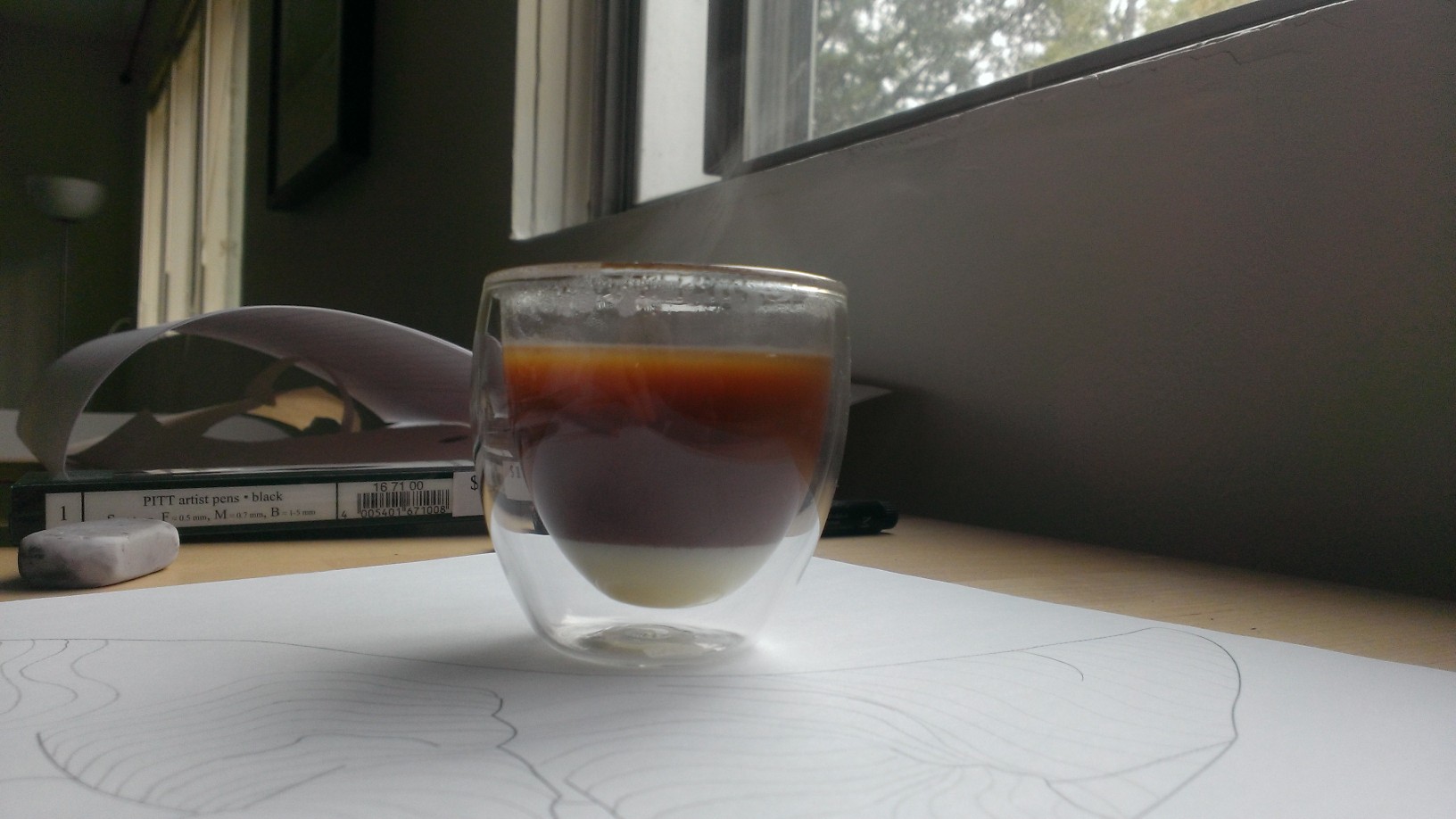


 Original sketch


 Messing in illustrator cont.
 Flat image in illustrator w/o outlines
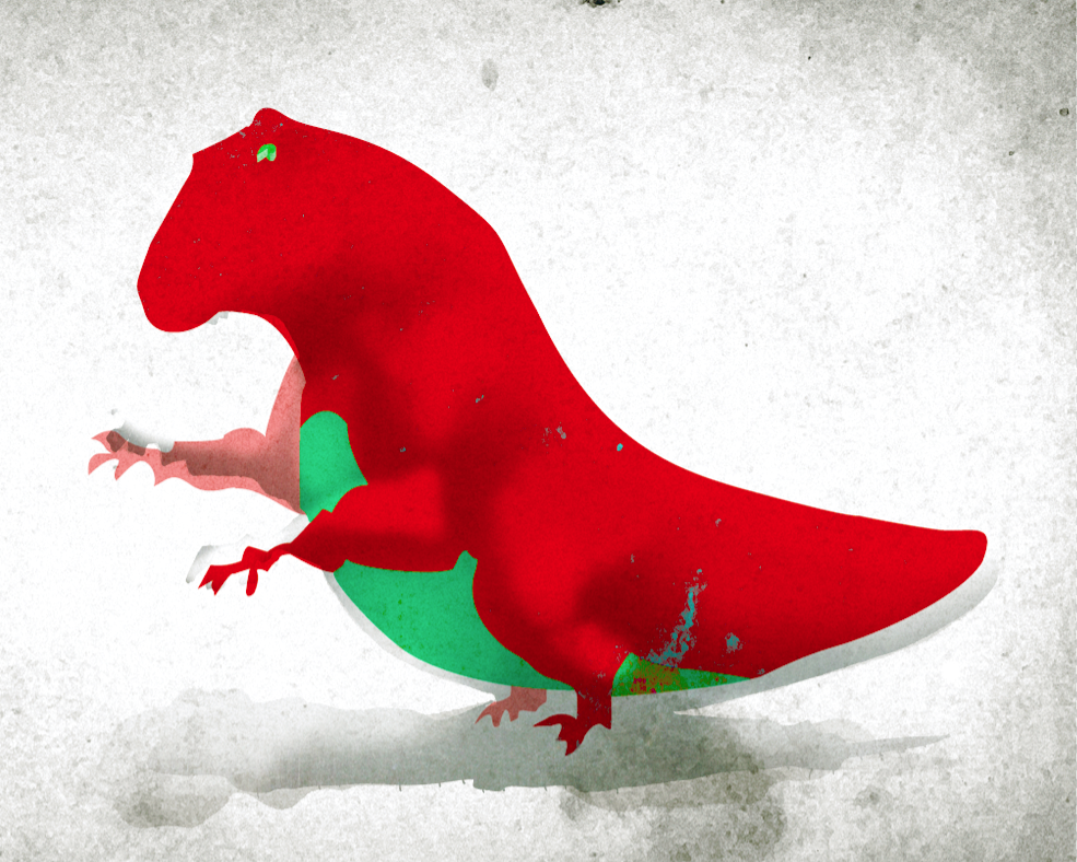
 Sketch w/ more interior lines


 I then drew out some text, and brought everything together in photoshop. The whole thing took maybe two hours from initial sketching to final product.


 So! I was supposed to be on campus today, but it is Labour Day, aka, no transit is running. And of course, it is a truth universally acknowledged, that a man in possession of an unexpected day off, must be in want of spontaneous creativity.


 When making a stencil, you are creating a sheet that has been perforated with a pattern or design, in my case a Rabbit tile. Using paint, the sheet can be used to transfer the single image over and over again. Here is the Image that I decided to use.


